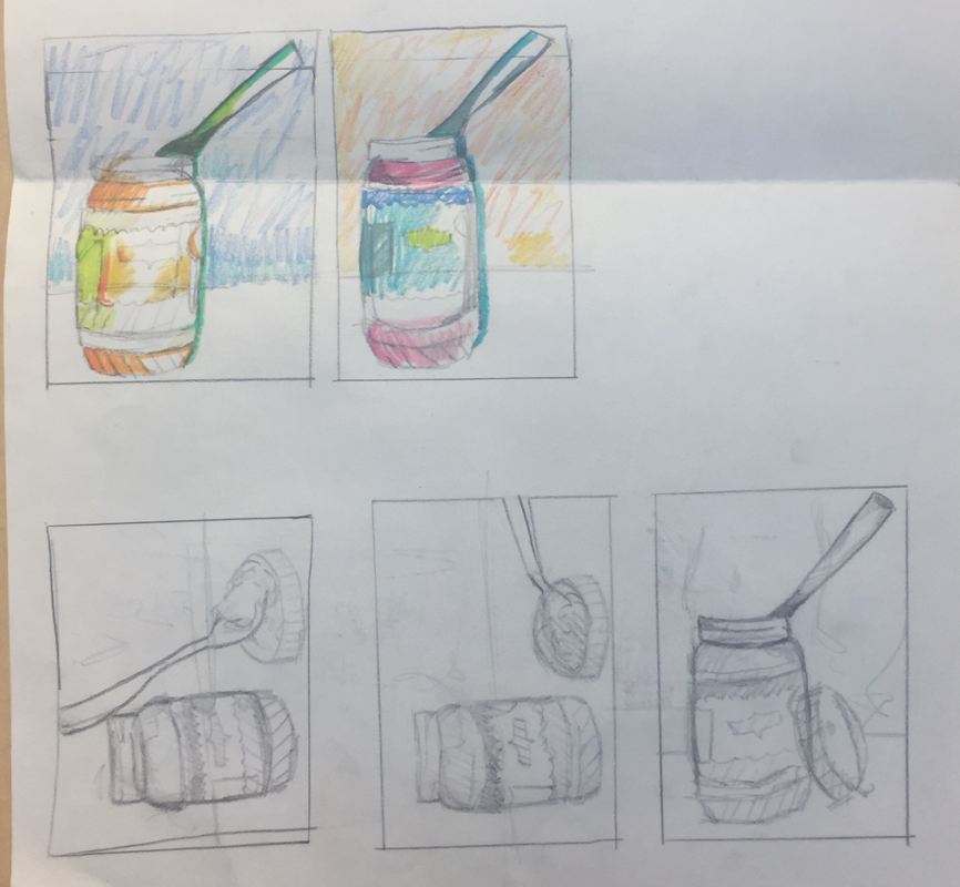
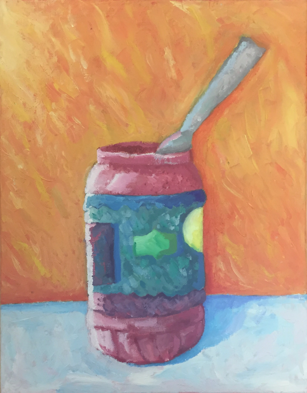
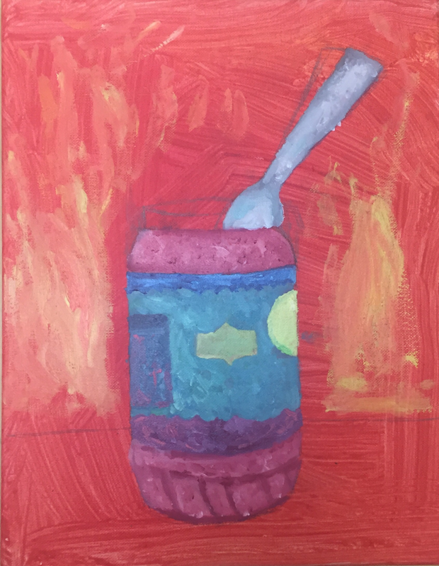
     For the brainstorming for this project, I thought of different things that fascinate me and aren't commonly used. I ended up narrowing down my ideas to a peanut butter jar and a bottle of Spic and Span.
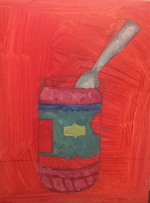
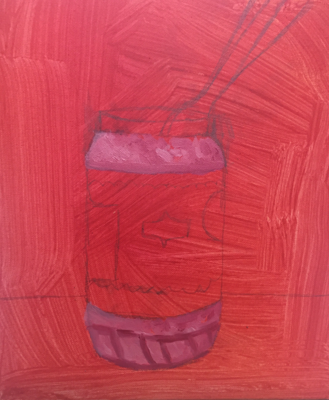
I ended up choosing my idea with the peanut butter jar because of the different ways I could position the spoon and take angles with it. I really liked the color scheme I used because the pink and blue colors are one of my top color combinations and I like how the original sketch looked for this piece. During this project I encountered a few artistic challenges, mostly with adding value to the piece. I ended up using different colors that aren't the base colors to add some value and a white strip to add the lighting. I learned that it's fun to add different colors and shades into each section using oil paint cause it makes the piece look more abstract and stand out more. I really love how the overall scattered color scheme ended up turning out in the end. I started out with a wash base and moved on to a light sketch of where I would be putting the base colors. I then sectioned out the colors such as the pinks and blues and once those dried I went into smaller details. The background came next and I went for a look where you could see the strokes clearly. Finally, I added a blue tinted off white for the counter and added the shadows. From this piece I can see that I have grasped a better understanding on my style in oil paints and how I can effectively add values and different colors and shades within my art.
0 Comments
Leave a Reply. |
AuthorWrite something about yourself. No need to be fancy, just an overview. Archives
January 2018
Categories |
 RSS Feed
