|
Over the past 5 months, I have grown not only as an artist, but have also gained many other things. There were many experiences that I have been through that have been some of the most important moments and I will always cherish them. The people I have had the pleasure of working with and the friends I've gained are very important to me. They are some of the sweetest, most talent human beings.
I remember the first week of art class, I was nervous that I wasn't good enough or that I would have trouble being able to portray my ideas. After talking to the others in our class, I felt a bit more confident in my art and once the first piece was finished, I was surprised at all the support I had. I never knew a group of people could not only be so nice and kind, but also helpful and motivated to help each other out. This was also the first year I joined the art society and I can say it has helped me open up more and become more involved in the art community at our school Through National Honors Art Society, I have participated in many different events. Walking in both the Homecoming and Christmas parades were fun and I had a great time. These people are some of the most creative and inspiring people I have come across and we all shared a mutual interest in creating art. One day in 3rd period I was able to go to downtown Apex and help put up and decorate the tree for the auction. It was amazing to see everyone's small canvases all together on the same tree, giving a creative and unique vibe that none of the other trees had. I am excited to see all the events that will be taking in the next semester and plan to participate in as many of them as I can. Fast forward to now, I have not only been exposed to many new mediums, but have also received a large amount of feedback on the way I create my pieces. Seeing what needed to be fixed or touched up in each piece is very helpful. I don't want to have elements that bring my piece down, and would much rather have a piece that i'm much more satisfied with in the end. I would have never known my strengths and weaknesses until this class and I am glad that I have this information. I am ready for my art journey to continue, I can already see improvement since my first day in the class. I am curious to see how much my art will be improved by the end of the year, I still have so much to learn. I wouldn't choose any other group of people to share this experience with. Mrs. Rossi has been an inspiring and influential role model and has helped me along the way and I am grateful for the things I have been taught. The second semester will be strong and I know our class has great things ahead of us.
0 Comments
This theme was one of my favorites in comparison to the whole semester. I really liked the concept of combining two things that are generally not shown with each other. Elements of nature are usually shown with other nature elements and mechanical elements are usually the same way. I got a sort of save the environment vibe from the theme so that's what I decided to go with.
I really thought about environmental issues I have noticed in my life, and the thing that stood out to me the most was when pandas were going extinct. As I was growing up, this was the first time I had even heard of extinction and I was scared because I loved pandas. I wanted to portray the effect we are having on wildlife so I went with a city theme that also incorporated pandas and their natural environment. It was a bit of a struggle to get my idea down, but once I knew what I wanted to do, I was able to start it and keep going with it. I had actually never drawn a panda before so it took me 2 tries to get it, having to adjust the arms and the legs. In the end, I like the colors I used, however I do plan on going back and adding more detail to the buildings in the back to make the piece come together more. Choosing a landscape picture was most likely the hardest part when it came to this project. I wanted to do something that wasn't generic and widely drawn. This crossed out things such as the beach or a forest. Taking a picture that had one tone of color and adding in new colors was something that I wanted to do, which would have been more fun with a creative landscape.
I decided on using a picture that Tori took in Las Vegas. She took the picture at Red Rock Canyon and I really liked the atmosphere that the picture portrayed. It just seemed like such a calm area and I wanted to capture it in my own way. The way the mountains were shown was very subtle and the plants popped out. Since I used oil, I had some issues when creating this piece. The first layer, took so long to dry, and its because my house is very humid and keeps paint wet. So after moving it into the art room, it dried and I began adding new layers, and I was working on it at a much faster rate. Overall, I like the use of color I gave this piece and how I was able to give it a messy look that pops. For this piece, we were instructed to take a picture of an animal and recreate it using any medium. I thought about all of the art pieces I have created so far this semester and I decided that it would be good for me to go back and use Prisma for a second time, since I enjoyed it so much the first time. For the picture of the animal I used, I ended up using Anna's cat, Napoleon.
This was actually a struggle for me since I wasn't very used to coloring fur on animals. When using Prismas, I always like to find hidden colors that you don't normally see within the piece. From the picture I was using, I was able to pull out pinks and blues as well as slight greens and yellows. For the final piece, I decided on a light pink blanket for the background. In the end, I do have to say this wasn't exactly my favorite piece I have made this year. If I were to redo this, I would give the entire piece a crosshatched look to make the cat look soft. I really like how texture can be created with Prismas and I will keep that in mind if I end up drawing an animal using them again. For this project, we were asked to create a self portrait and were allowed to choose any medium to make it. We then were told that we had to make sure our self portraits were not generic and that there were elements within the piece that made it stand out. I took some pictures and messed around by putting paint on my face and using a matching bandanna. After all of the different pictures I took, I ended up using this one for my piece.
For my medium, I went with digital. Digital is a medium that I have a decent amount of knowledge with and have been working with it for around 5 years. This piece, however, was new to me. I had never attempted semi-realism and have only done a few test sketches for it, so this was a step out of my comfort zone. To achieve the look I got, I started with the base skin color and went over with generic shapes of color and slowly got deeper with color values. For realism, i had quite a few issues that I had to overcome. Usually I have exaggerated features with eyes and lips with my general cartoon style so I had to conform the shapes to be slightly more anatomically correct. Coloring was also an issue cause I'm not used to getting deep colors on the skin tones. In the end, I was able to pull it all together and create this piece, I am happy with how it turned out and I am glad I went out of my usual comfort zone. 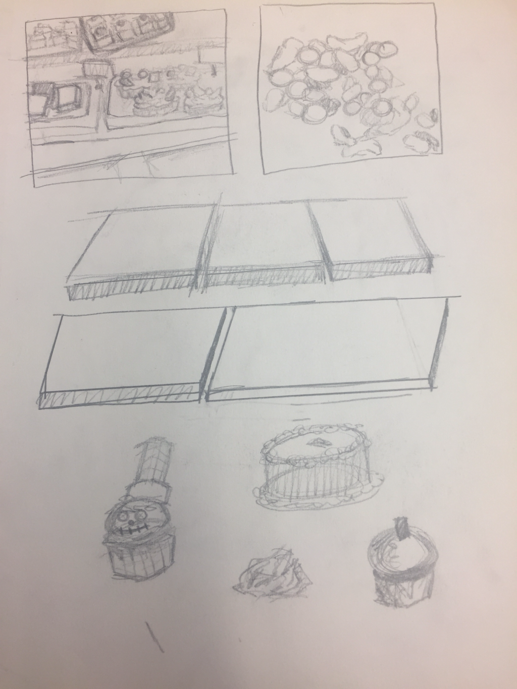 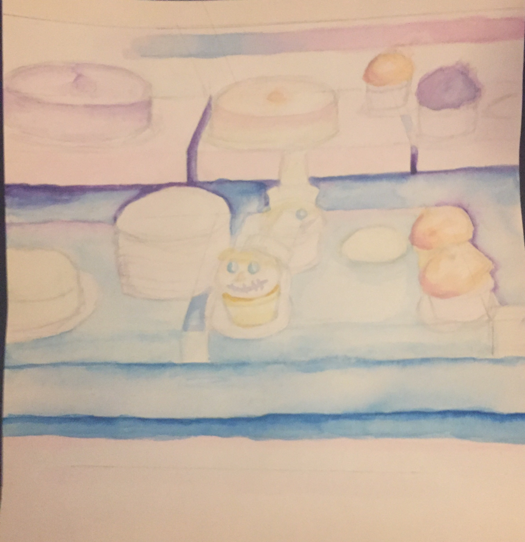 For this project we had to choose an interesting interior of an object and portray it using any medium. I started off with a list of 20 ideas including the inside of an oven, a container of trail mix and others. I ended up choosing the idea for the inside of a bakery display case. It was an interesting composition with the messy misplacement of the cakes and cupcakes. I thought it had a nice color vibrancy and would be fun to portray onto paper.
I ultimately ended up with using watercolor and colored pencils for my piece. I think the messy design of the watercolor gave the piece that soft boost to the eyes. I wanted to create something that was fun and colorful but also soft and gentle. I really find a calming effect when looking at soft colored foods and sweets, it gives off a vibe. I really wanted to create that vibe with my piece and I'm happy with the way that it's turning out so far. 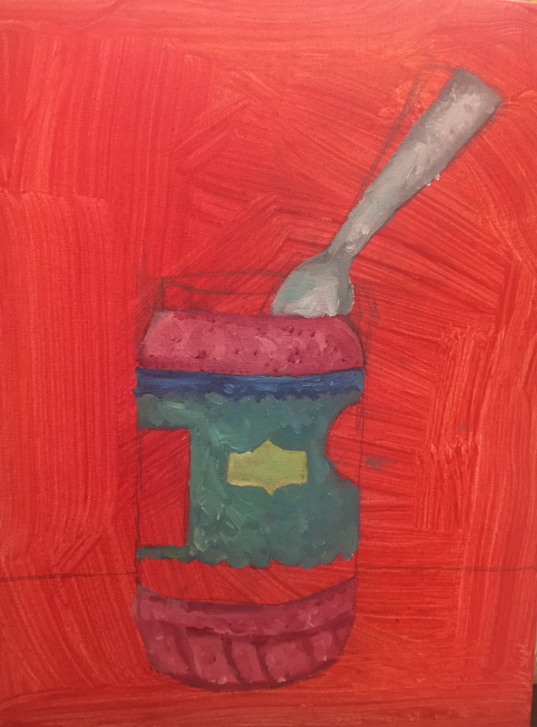 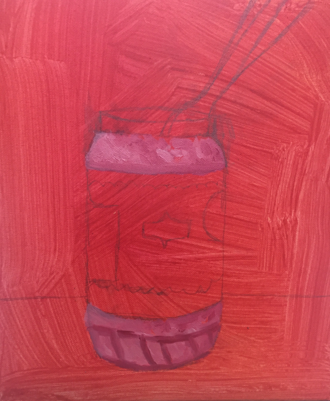 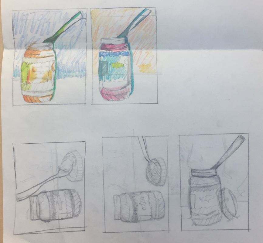 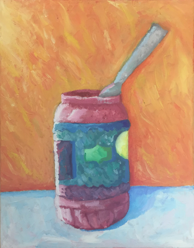 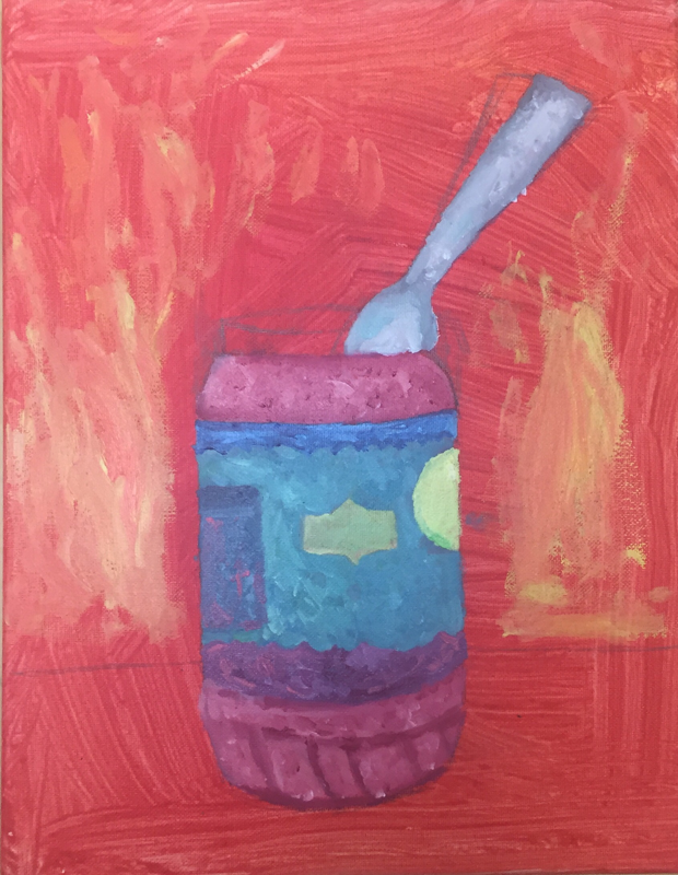 For the brainstorming for this project, I thought of different things that fascinate me and aren't commonly used. I ended up narrowing down my ideas to a peanut butter jar and a bottle of Spic and Span.
I ended up choosing my idea with the peanut butter jar because of the different ways I could position the spoon and take angles with it. I really liked the color scheme I used because the pink and blue colors are one of my top color combinations and I like how the original sketch looked for this piece. During this project I encountered a few artistic challenges, mostly with adding value to the piece. I ended up using different colors that aren't the base colors to add some value and a white strip to add the lighting. I learned that it's fun to add different colors and shades into each section using oil paint cause it makes the piece look more abstract and stand out more. I really love how the overall scattered color scheme ended up turning out in the end. I started out with a wash base and moved on to a light sketch of where I would be putting the base colors. I then sectioned out the colors such as the pinks and blues and once those dried I went into smaller details. The background came next and I went for a look where you could see the strokes clearly. Finally, I added a blue tinted off white for the counter and added the shadows. From this piece I can see that I have grasped a better understanding on my style in oil paints and how I can effectively add values and different colors and shades within my art.
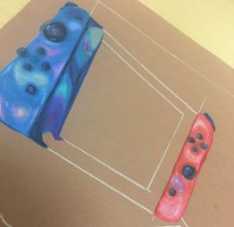
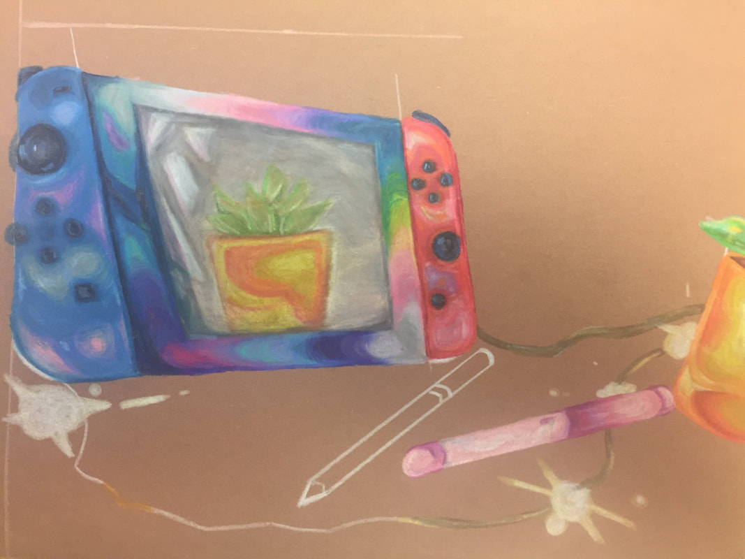
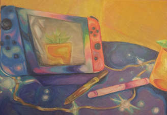 For this art piece, we were instructed to draw something that shows a form of reflection. It was meant to be literal, but could be an interpretation view as well. Some of my early concept ideas included mason jars, phone screen, glass cup with iced tea. All of these ideas showed a little bit of me in them and I thought that was cool, but I wanted something that definitely put out more than one aspect of me as a person. This is why I decided to go with a mash up of things on my desk which represent me. Nintendo Switch, sketching pencils, markers, fairy lights and last but not least, a succulent.
Throughout the piece I started with sketches and concept photos that helped me figure out a way I wanted to place the objects and take the angle of the photo from. This final picture I used came from a set of around 5 photos. From then, I sketched out a version of the piece that I found fitting and tried a few different papers to go behind the picture. I found that the darker brown color definitely suited me the best when I was working with the Prismas. I definitely had a few struggles while creating this piece. First, I had trouble adjusting to the paper and ended up having to start over, it ended up working out because I preferred the second sketch better. Things I found successful was the colors I used throughout the piece. Instead of using black, I thought of the refracted colors coming from the fairy lights created a rainbow effect so I ended up using those colors. I think looking outside the box of colors and seeing alternate colors in the image was my strong point and bringing out the brighter hues of them really pulled my piece together. The philosophy of art is something that is very different for every person who makes, appreciates and critiques art. This is my philosophy of art.
Art is definitely a strong point of communication in my opinion and I think that every piece is communicating something, whether it be a bowl of fruit or even a skyscraper. Each individual artist does things their own way when they are designing and creating a piece, which I think shows a lot of communication. When I create a piece, I want to communicate to my viewers a wide range of emotions. I will tend to draw happy, cheerful types of art because I know that lighthearted art can help boost someone’s emotions. I also do have times where I am not feeling the best and I think it’s important to show that and communicate it through my work. I like to communicate these emotions by having a cluster of emotions within my pieces. I want others to view me as an artist like they would view a weather forecast. Some days are sunny, some gloomy and there are some rare thunderstorms. I think it’s important to express all of these into my artwork. When other people see my work, I want them to feel a wide range of emotions as they’re seeing all my pieces together. Some people focus on only the happy things, some only on the sad, but I think it’s important to show that not everyone is happy or sad all the time, we all feel different things. Artistic ideas for me, come from anywhere. Things that drive me the most, however, are things that evoke emotions. I love to see things that will make people feel a certain way when they look at them. Not just the basic things like, sunrises or thunderstorms. I like to see smaller things that can bring back feelings like nostalgia or feelings that aren’t as recognized as often. If I see something that brings back memories to me, it’ll inspire me and maybe others out there will have that same feeling that I felt when I saw it. I think it is very important to show emotions in your art. It can show others how you’re feeling and show us that we all express ourselves in different ways, and for some of us, its art. People all around can create and view art and share viewpoints and emotions, bringing us all together in a way that words themselves cannot do. |
AuthorWrite something about yourself. No need to be fancy, just an overview. Archives
January 2018
Categories |
 RSS Feed
